Logo, coat of arms and guidelines

The Loimaa logo is used primarily in communication and marketing. The symbolic part of the emblem is an ear of corn which consists of two grains and awns. The shapes of the letters A are taken from the grain silos, which are a prominent landmark in the area known as Finland’s grain fields. The circular letter O refers to a strong and successful ball game city.
The logo will always be coloured forest green in its entirety. If technical constraints make it impossible to use this colour, the logo will be entirely black or white. For colour options and further details on the use of the logo, please refer to the attached graphic guidelines.
The city’s partners can request the logo from the marketing department.
Coat of arms of the city of Loimaa
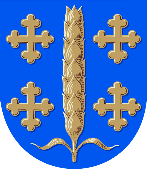
The coat of arms of Loimaa is explained as follows: ‘In the blue field a wheat cone with two leaves and four clover crosses on the background 2+2; all gold’. The grain ear in the coat of arms depicts Loimaa’s fertile field landscape. The coat of arms was designed by Aake Kaarnama.
The coat of arms was originally established in 1952 by the Loimaa County Municipality. The cloverleaf crosses next to the grain mill refer to the four independent municipalities separated from the rural municipality, namely Alastaro, Loimaa town, Mellilä and Metsämaa.
The city of Loimaa adopted the coat of arms in connection with the merger of municipalities at the beginning of 2005. The rights to use the coat of arms are granted by the municipality manager to entities outside the city. The coat of arms may not be modified and may only be used for the purpose for which it has been authorized.